Before the Icon: How Symbols Found a Place on Signs
Public sign symbols grew from pictures into shared conventions. Learn how context, labels, and audience shape a sign that people can interpret clearly.
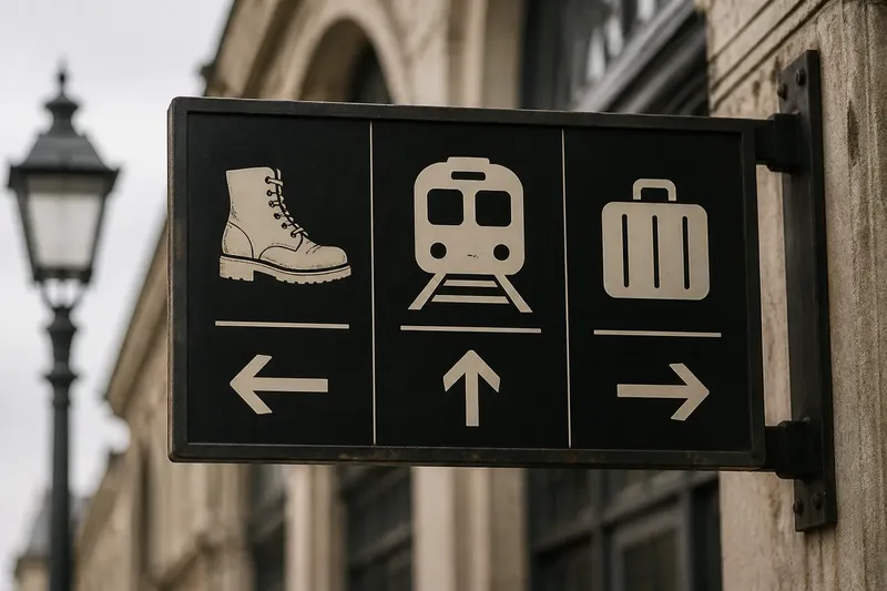
At a station entrance, a small suitcase beside an arrow can point a traveler toward baggage services before they read a word. Public sign symbols have long helped people locate places and services, but pictures do not speak universally: people interpret them through repeated use, context, and sometimes written labels.
A sign symbol is a picture-based mark that stands for a place, service, action, or warning. Its history brings together recognizable pictures, simplified conventions, and symbols paired with words. Each approach suits a different communication problem. The choice depends on what people need to do, what they are likely to recognize, and how much ambiguity the sign can tolerate.
Pictures Before Systems
Early public signs often relied on images closely tied to their subject. A painted boot could point to a shoe repairer; a cup could identify a place serving drinks. Such signs made practical sense where readers spoke different languages or literacy could not be assumed. People did not need to read a business name to notice an object associated with its trade.
This approach is direct, but its meaning has limits. A picture of a key might suggest a locksmith, a place to collect keys, or a door that requires one. The image offers a clue, not a complete explanation. Context does much of the work: a key painted over a shop entrance is more likely to identify a service than a key on a locked gate.
Pictures also reflect the objects and conventions familiar to the people who encounter them. A local image can feel immediate to one audience and puzzling to another. A symbol that depicts a service using an unfamiliar tool may communicate less clearly than a plain word or a more commonly recognized picture.
From Pictures to Conventions
As travel and public services connected larger groups of people, signs had to communicate beyond a single shopfront or neighborhood. A symbol could no longer depend entirely on local custom. Designers and institutions favored simplified, repeatable images that could appear across related signs and places.
Simplification changes what a sign asks of the viewer. A detailed illustration may show exactly what an object looks like, but small details can disappear at a distance or in a crowded setting. A pared-down outline makes the object easier to recognize quickly, though it may also remove clues that distinguish one meaning from another.
Repeated use helps turn a designed mark into a convention. People learn that a particular image points to a particular service because they have seen it used that way in a familiar setting. Recognition then comes partly from the graphic and partly from the expectation built around it. A symbol can feel obvious after it becomes customary without having been self-explanatory at the start.
That distinction matters when a symbol is introduced somewhere new. Copying a familiar mark does not automatically transfer the understanding attached to it. The sign’s location, nearby information, and the audience’s experience all affect whether its intended meaning carries over.
Three Sign Approaches
Public signs generally use one of three approaches, or combine them: a recognizable picture, a standardized symbol, or a symbol alongside a word. None is best in every situation.
Recognizable pictures
A picture that closely resembles a familiar object can suit a place where the service is concrete and the image is easy to identify. A simple cup, for example, may work near a café entrance. But a picture becomes less dependable when one image could name several services or when the pictured object is not equally familiar to everyone.
This approach works best when the sign can rely on nearby context. It is less suited to instructions that need to distinguish between similar actions, such as entering, collecting an item, or asking for help.
Standardized symbols
A standardized symbol is a mark used consistently within an institution, system, or set of signs. It can help people who have learned that convention, and repeated use gives a group of signs a coherent visual language. A transit network, for instance, may use the same established mark for a particular service across stations.
Consistency is useful, but a symbol’s status as a standard does not mean everyone knows it. A first-time visitor may not have learned the convention, and a mark that resembles a familiar picture can still be interpreted differently. Standardized symbols suit settings where people encounter the same system repeatedly or where other cues support recognition.
Symbols with words
Pairing a symbol with a short label gives readers two routes to meaning. A picture can help someone scan the sign, while the word clarifies what the picture alone leaves open. This is especially useful for services, rules, or instructions that cannot be represented by one obvious object.
Words do not solve every language difference, and a long label can be hard to read quickly. Still, a concise label in a language the audience understands can make an unfamiliar symbol easier to learn. Where several languages are needed, the sign can retain a clear symbol while using brief, carefully selected text.
Choosing a Sign Form
Choose the approach by asking what the sign must communicate and what the viewer is likely to know. A sign naming a familiar facility can often use a recognizable picture. A sign within a consistent network may benefit from a standardized symbol. A sign that gives a less familiar instruction may need both image and words.
- Identify the task. Check whether the sign names a place, locates a service, or directs an action. If it only names a facility, use a suitable picture or label; if people must act, add wording that makes the action clear.
- Consider the audience. Check whether viewers are likely to know the symbol system. If they use it regularly, a consistent symbol may suffice; if many are first-time visitors, pair it with a concise label or another familiar cue.
- Check for competing meanings. Ask what else the pictured object could suggest in that setting. If it has a plausible second meaning, revise the image or add a clarifying word; if its meaning is distinct in context, retain it.
- Consider distance and surroundings. Check whether the main shape remains clear when viewed from where people must make a decision. If details blend into visual clutter, simplify the silhouette or move supporting text closer; if the sign is read nearby, a short label can carry extra detail.
- Consider the cost of confusion. Check what could happen if someone misreads the sign. If misunderstanding could send a person to the wrong place or prevent access to a service, add clearer wording or supporting information; if the stakes are low, a picture with context may be enough.
- Keep related signs consistent. Check whether the same mark keeps the same meaning across the system. If it changes between locations, standardize it and update the signs; if the meaning differs by place, distinguish the signs with labels rather than relying on the shared picture alone.
Imagine a community center has an unlabeled room where visitors can ask for assistance. The staff’s starting idea is a raised hand, which could also mean “stop.” They replace it with a person-at-a-desk symbol and the words “Information desk,” then place the sign at the corridor entrance. The resulting sign identifies the service in text while retaining a visual cue; the tradeoff is a little more space used by the label.
What Can Sign Symbols Say?
Sign symbols communicate through both their image and their setting. An entrance, corridor, platform, or service counter narrows the possible meanings, but context cannot always distinguish them. A pictogram of a person running might suggest an exit, a race, or a direction to move quickly unless the surrounding sign system makes its role clear.
Symbols also carry tone. A friendly drawing may make a public service feel approachable, while a severe, high-contrast mark may signal a rule or hazard. Tone can help people sense how to respond, but it should not replace the actual instruction. When misunderstanding could matter, words and established safety conventions should support the picture; follow applicable standards and local requirements.
Materials and placement affect interpretation, too. A finely detailed image may lose distinctions when reduced or viewed across a hall. A bold silhouette can remain legible, but its simplicity may leave several meanings open. A designer can review a draft at its intended viewing distance and amid the visual clutter of its setting, then ask people unfamiliar with it what they think it means.
How Do Sign Symbols Work?
Are sign symbols universal?
No picture carries exactly the same meaning for every audience. Familiarity, culture, context, and previous exposure all shape interpretation, so treat a symbol as a visual cue rather than a substitute for understanding the people who will see it.
When should a sign include words?
Use words when a picture could reasonably mean several things, an instruction is unfamiliar, or misunderstanding would matter. A short label can clarify the symbol without making the sign depend on a long explanation.
Does a standard symbol explain itself?
Not necessarily. Standardization makes a mark consistent within a system, which helps people learn it through repeated encounters. New visitors may still need a label, context, or supporting sign.
How can a designer check a sign’s meaning?
Show a draft in the place where it will appear and ask people who have not been taught its intended meaning what they think it indicates. If their answers diverge, revise the image, add a concise label, or provide a nearby cue.
Recognition Takes Context
The history of public sign symbols is not a march from words to pictures, or from pictures to a universal visual language. It is a gradual development of conventions that help people find places and understand services, with each symbol depending on its setting and audience. A good sign makes its intended meaning easier to reach without pretending that recognition is automatic.
For a public sign, start with the action or service people need to identify, then decide whether a picture, a familiar standard, or a picture with words gives them the clearest cue. Public sign symbols work best when their visual language is learned, supported, and suited to the place where people meet it.