Buttons or Links: Choosing a Clear Action on a Screen
Choose buttons or links by the result each control produces, so people can predict actions, understand destinations, and use your interface with confidence.
You are reading a recipe on your phone and reach two controls: “Save recipe” and “See all soups.” The first changes something about the current page; the second takes you to another destination. This simple distinction helps you choose between buttons and links—and helps readers anticipate what a screen will do.
Button or link?
A button performs an action in the current interface. It might submit a form, open a menu, start a download, or save a preference. A link takes the reader to a destination, such as another page, a section of the same page, or an external site.
In HTML, a button is generally represented by <button> . A link uses <a> with a destination in its href attribute. These elements tell browsers and assistive technologies what the control is for, so choose the semantic element before styling it.
Appearance alone does not determine a control’s role. A colorful rectangle can be a link, and underlined text can trigger an action, but those treatments may mislead readers if they conflict with the result.
Action or destination?
Ask what should happen immediately after someone activates the control. If the interface should carry out a command, use a button. If the person should arrive at a destination, use a link.
- “Send message” submits entered information. Use a button; if it sends the reader to a separate confirmation destination instead, use a link for that destination.
- “Read the privacy policy” opens a document. Use a link; if the control instead opens an in-page disclosure, use a button.
- “Show filters” reveals controls without leaving the page. Use a button; if it leads to a dedicated filtering page, use a link.
- “Browse products” opens a product listing. Use a link; if it applies a selection on the current page, use a button.
- “Clear search” removes text from the current field. Use a button; if it opens a separate search page, use a link.
- “Download report” points to a file for download. Use a link; if it starts a specific application action rather than opening a file destination, use a button.
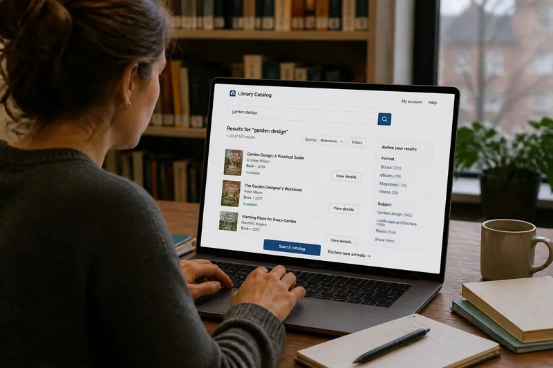
Say you are designing an invented library catalog with a search field. The reader enters “garden design” and activates “Search catalog”; the page displays matching results, so that control acts as a button. Next to it, “Explore new arrivals” opens a separate listing, so it is a link. The words are both invitations, but their outcomes determine the elements.
A link can load new content without a full page refresh and still be a link. If the reader is going to a meaningful destination, focus on that destination rather than on the technical details of how the page renders.
Common interface controls
Forms usually use buttons for commands such as submitting, clearing, or revealing fields. A nearby link might lead to account help or explain how submitted information is used. Keep the roles distinct even when the controls sit close together.
A menu control that expands or collapses a menu is a button because it changes the visible interface. Menu items are usually links when they lead to pages. The menu button should have a clear label and communicate whether the menu is expanded or collapsed.
Tabs, accordions, and filters represent different relationships. Tabs switch among related panels; accordions reveal or hide content; filters change which items are shown. Buttons commonly operate these controls, while links may take readers to separate destinations. Choose according to the behavior, not merely the visual pattern.
For files, distinguish between a link to a file and an application-specific command. A link can point to a file for opening or downloading; a button can start an action such as exporting a report. Make the label explain what the reader can expect.
Labels that set expectations
Write labels around the outcome. “Create account,” “Apply filters,” and “Play video” describe actions. “Account settings,” “Filtered results,” and “Video transcript” name destinations. A concise label can work when nearby text supplies the context.
Avoid using “Click here” as the only link text. Readers may scan links out of context, and assistive technology may present them as a list. A destination-specific phrase such as “View the delivery options” communicates more.
Buttons often benefit from verbs, but a link does not always need to begin with one. “Contact support” could name a destination, while “Start a support chat” describes an action. If the result is ambiguous, clarify the label or add nearby context rather than relying on color or shape.
How do links and buttons behave?
Should a link open a new tab?
Usually, let readers decide whether to open a destination in another tab. If a link needs to open a new tab, explain that behavior in its label or nearby text so the change does not surprise people.
Can a button lead to another page?
It can, but a link is generally clearer when navigation is the whole purpose. Reserve buttons for commands and interface changes so people can form reliable expectations.
What about a link that changes the page?
A link may open another page or move to a section on the current one. If activating the control changes a setting or reveals interface content instead of taking the reader to a destination, a button is usually more appropriate.
How can I check the choice?
Read the label, activate the control, and describe the result: “This takes me to…” suggests a link; “This does…” suggests a button. Then check that keyboard focus is visible and that the control works with the expected keyboard behavior.
Visual cues and mixed outcomes
Make the appearance support the control’s role. A button might have a filled background and clear boundary; a text link can use underlining or another consistent cue. Color alone is not enough: text, shape, contrast, and placement all help readers recognize an interactive element.
Keep visual conventions consistent across a product. If links are underlined in one area but look like plain text elsewhere, readers may have to guess. If every link and button looks identical, an important signal about navigation versus action disappears.
Some controls combine an action with navigation. A “Buy now” control might submit an order and then lead to a confirmation screen; “Download report” might retrieve a file. Choose the element that best represents the reader’s primary intent, and use a brief explanation when the result might not be obvious.
A link can receive button-like visual styling when it leads to a prominent destination. A button can be styled quietly when its action is secondary. Keep the underlying element aligned with the behavior.
When choosing buttons or links, start with the destination-versus-action question, then make the label and appearance confirm your choice. As a final check, move through the page with a keyboard: a visible focus indicator helps readers track where they are before they activate a control.