Why Empty Space Gives a Page Its Rhythm
Why empty space gives a page its rhythm: learn to read margins, headings, and text blocks so you can see how spacing groups information and guides the eye.
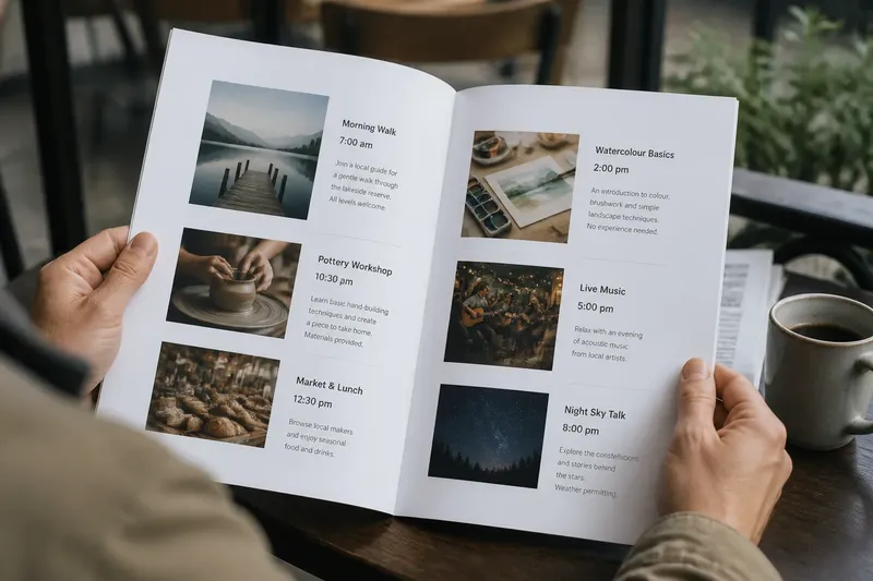
You open a printed program while waiting for a friend and scan the page for the start time. A bold heading catches your eye, but the date sits close to the paragraph above it, and the next event begins only a short distance below. The page contains the details, yet its spacing makes the relationships harder to read. Why empty space gives a page its rhythm becomes clear when you notice that blank areas help readers tell one group of information from another.
In graphic design, empty space—also called white space—means the unprinted or unused area around and between elements. It need not be white. A pale background, a wide outer margin, or a gap between paragraphs can all serve the same purpose. The space is not leftover decoration; it affects how a page is divided, where a reader pauses, and what seems connected.
Space as a signal
Readers rarely inspect every detail in order. They glance at a page, notice prominent forms, then decide where to look more closely. Spacing supports that process by making groups visible. A heading with open space above it can announce a new section; a compact heading and paragraph can read as one unit. A wide gap between two such units suggests a change of subject.
Consider the relationship between distance and grouping. If a caption sits closer to an image than to the paragraph below, it is more likely to be read as the image’s caption. If the gap is reversed, the caption may appear attached to the paragraph. The words have not changed. Their surroundings have changed the apparent meaning.
Margins do related work at the edge of a page. They create a boundary between the content and the physical edge, giving text a defined area to occupy. A narrow margin can make a page feel dense; a generous one can make the same amount of copy feel more contained. Neither is automatically better. The right choice depends on the amount of material, the page’s purpose, and the reading conditions.
When you look at a page, ask what each gap seems to connect or separate.
A week of looking
A short routine can train your eye without turning every page into a design assignment. Use one ordinary printed or digital page each day: a community notice, a recipe, a transit leaflet, a library handout, or a screen with a clear beginning and end. Spend a few minutes observing before deciding whether the layout works.
- Monday, find the outer boundary. Look at the margins on all sides. Notice whether the text sits evenly within its area or whether one side has a wider margin that might leave room for notes, a binding, or a visual element.
- Tuesday, trace the headings. Locate each heading, then look at the space above and below it. Ask whether the heading seems to introduce what follows or has drifted toward the section before it.
- Wednesday, map the text blocks. Notice paragraph lengths, line breaks, and the gaps between paragraphs. See whether the page presents one continuous stream or several distinct groups.
- Thursday, compare neighboring groups. Pick two items, such as a title and its description. Decide which spacing cue makes them appear related, and which cue separates them from the next item.
- Friday, follow the eye. Let your gaze land naturally on the page. Note where it pauses, where it jumps, and whether the spacing makes the next place to look apparent.
- Saturday, cover the words. Use a blank sheet or your hand to hide the text while leaving the layout visible. Look at the shapes and gaps alone: can you still tell where sections begin and end?
- Sunday, compare impressions. Return to one page from earlier in the week. Write down one relationship you noticed and one question you still have, such as whether a heading needs more separation or a caption needs to sit closer to its image.
Keep the notes observational rather than prescriptive. A page can be dense by design, as in a reference sheet where readers need to compare many entries. The useful question is not simply “Is there enough space?” but “Does the spacing make the intended grouping legible?”
Margins, headings, blocks
These three features work together. Margins establish the overall field. Headings divide that field into sections. Text blocks fill the sections with smaller units of information. When one part changes, the others can seem to change too: increasing a margin makes the text area feel narrower, while increasing the gap between headings can make sections appear more independent.
Imagine a neighborhood bulletin with a page of announcements. The designer begins with a centered title, a slim outer margin, and four tightly packed blocks. Readers have trouble seeing which date belongs to which event. Suppose the designer moves each date closer to its event title, gives each announcement a consistent internal gap, and adds a little more space between announcements. The expected visible result is clearer grouping, even though the wording and order remain the same.
This invented situation illustrates why spacing is relational. Adding the same amount of blank area everywhere may not help: it could loosen the page without clarifying which details belong together. Instead, compare the gap within a group with the gap between groups. A smaller internal gap and a larger dividing gap usually make the boundary easier to perceive.
Try squinting slightly or looking at the page from farther away. Fine text becomes less distinct, but the broad arrangement remains. If the page still appears as one undifferentiated block, its large-scale spacing may not be signaling the structure strongly enough.
What should you notice first?
How do I tell whether a heading belongs to the section below it?
Compare its distance from the text below with its distance from the text above. If it sits visually closer to the preceding section, readers may interpret it as that section’s ending rather than the next section’s start.
What is the difference between margins and gutters?
Margins are the spaces along the outer edges of a page or content area. A gutter is the space between columns or neighboring content areas, helping keep them distinct.
Does more empty space always improve readability?
No. Space helps when it clarifies structure or gives a busy area room to breathe, but excessive gaps can make related details feel disconnected. Judge each space by the relationship it creates, not by how large it is.
How can I inspect a page on a screen?
View the page at its usual reading size, then scroll through it at a natural pace. Notice whether section breaks, headings, and blocks remain easy to locate without zooming or relying only on color.
When spacing feels uneven
Uneven spacing is not always a flaw. A large gap can mark a major transition, while smaller gaps can hold items within a section together. The question is whether the variation has a visible purpose. If similar sections use noticeably different spacing, a reader may infer a distinction that the content does not intend.
Look for patterns rather than isolated measurements. Do headings consistently receive more space above than below? Do paragraphs within one section have a steady rhythm? Are captions treated similarly across the page? These repeated relationships create a quiet grammar. When one instance breaks the pattern, it draws attention; that can help emphasize a special item or distract from the message.
On a long page, spacing also affects pace. Closely set paragraphs can encourage continuous reading, while a clear gap can invite a pause before a new thought. This does not mean that every paragraph needs a dramatic break. A modest, consistent separation can be enough to keep the text from merging into a wall.
For a quick comparison, print a page or capture a screenshot and make a duplicate. In one copy, lightly mark the margins, heading positions, and boundaries between blocks. In the other, cover the words and observe only the blank areas. The first view shows the content structure; the second reveals how much the layout communicates before a reader has read a sentence.
Reading the blank areas
Return to the page that first caught your attention. Look at its outer margins, the distance around its headings, and the gaps that separate its text blocks. Ask what each blank area tells you about the material beside it. That simple inspection turns why empty space gives a page its rhythm from an abstract design idea into something you can see on a bulletin, a program, or a page on your screen.
One useful habit is to name the relationship before proposing a fix: “This date appears attached to the wrong event,” or “These sections look like one group.” That description keeps attention on what a reader can actually perceive. Once the relationship is clear, spacing becomes a practical way to shape the page’s rhythm without adding another word.